Editor’s note: The MLS partnership with Opta Sports has resulted in richer ways to understand the performance of the Philadelphia Union and its players through statistical analysis. PSP’s efforts to collect and share match statistics have been enhanced by the deeper analysis offered by Ford Bohrmann. We are now excited to share the work of Rolando de Aguiar and welcome his contributions to our endeavor to better understand what is happening on the pitch.
Ed Farnsworth wrote an interesting post in early December looking at the Union’s passing numbers. I took this data and broke it down a little more, in order to understand it better.
The relationship between usage and efficiency is an interesting one; i.e. what happens when a player is required to do more of x in a game? Usually, his efficiency decreases in that area. (Exploring the nature of this relationship is a small industry in basketball analytics.) The intuitive reasons for this are straightforward: when he doesn’t have to do much, he does what is easy; when he has to do more, he has to do some things that are harder. In taking on difficult tasks, he has more trouble finding success.
Ed’s data showed passing efficiency (pass completion percentage) and usage (pass attempts), but the latter was not adjusted for playing time. The chart below (for outfield players with > 500 minutes) adjusts for playing time.

That data allows us to plot passing usage (i.e. number of passes per 90 minutes) vs. passing efficiency.

Importantly, note that the players appear in positional bands. The natural shape of this data suggests to me that a huge component of these passing statistics is structural—passing accuracy and pass frequency are largely dependent on the position the player is playing. However, we can see clear differences between players within these bands.
Within these bands, the players at the bottom right (e.g. Sheanon Williams among defenders, Roger Torres among attacking midfielders, Sebastien Le Toux among forwards) are high usage, low efficiency passers, while those at the top left (Danny Califf, Justin Mapp, Danny Mwanga) are low usage, high efficiency. To put that in everyday terms, Torres (and Williams) make a lot of passes, and not very many are successful. They take risks when passing. Califf and Mapp were more conservative.
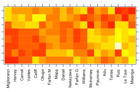
The following is a dendrogram generated from a cluster analysis of the data above:

Since I included only two variables—passing rate and passing accuracy—in the analysis, it’s essentially a different view of the data above. Cluster analysis becomes much more useful when looking at a greater number of variables. See below, and let us know in the comments if this sparks any ideas.


You do realise that all the stats make Miglioranzi look fantastic until the last graph right? Very interesting to see how the “offensive rate clusters” very well. Ruiz/LeToux/Mwanga were our best offensive threats, Adu and Torres clustered together (same type player). Williams and Garfan were very high – with maybe Marfan not being as good as we thought (clustered more towards the defenders). The defenders all grouped at the end is expected- including Carroll as a defensive player.
I take two messages away from this:
#1) Whatever Migloranzi did badly, it wasn’t aggregate-level passing.
#2) This level of passing stats don’t tell us that much. The fact that all of our defenders and defensively oriented midfielders make a lot of passes, at a high rate, doesn’t mean that they’re better passers than our attackers. Rather, it more likely suggests that they have easier passes to make, and more time to make them.
I think the most interesting thing on the clusters stuff is to see players who *don’t* play the same position clustered together, or to see players who do play the same position but are not closely related.
One of the interesting things about the shift from Jordan Harvey to Gabriel Farfan is that Farfan and Harvey do not look similar at all. Farfan and Williams, in the aggregate, do very similar things offensively. We know that from looking at the game, but here are some ways that we can quantify that.
Another thing that was kind of interesting: of all of these players/stats, which was the biggest outlier? Carlos Ruiz’s goal-scoring rate. Not shots on goal—Mwanga and McInerney were up there with him. But those guys didn’t get the goal past the keeper; Ruiz did.
Watch it Rolando- you might not want to point out the obvious around here (Ruiz is better than Mwanga and McInerney).
I’m not sure how apparent it is from these data, but it’s a good question that we can answer analytically. I’ll check into it in some more detail.
Where did this data come from? Is it available to everyone?
Liz, PSP (not sure who, it wasn’t me!) went through game by game chalkboards on mlssoccer.com and compiled the data. I then massaged it for this analysis.