To view an updated version of this article at the Society for American Soccer History website in which some of the speculation below has been confirmed, click here.
The recent release of the designs for the new Philadelphia Union home and away kits got me thinking about the evolution of the kit designs of other teams in Philadelphia soccer history. Today, the regular release of new jerseys is an important part of the marketing of a professional team, not to mention a lucrative source of revenue. The Union for example, entering its third season, will have featured five different jerseys.
Such a turnover rate is an expensive proposition and would be beyond the financial reach of most clubs from Philadelphia’s storied soccer history. But one team, Bethlehem Steel FC, did have deep pockets. After all, the team was owned by the Bethlehem Steel Company. Looking at photos of the team from between 1915 and 1925, seven different jersey designs can be found.
Bethlehem Steel FC
When it comes to teams in the early days of Philadelphia soccer history, definitive knowledge about the kits the teams wore is difficult to come by. If you can find photographs, which is difficult enough, finding out something as simple as the color of the kits can be even more difficult since the images come from the age of black and white photography. The closing of the largely volunteer run National Soccer Hall of Fame Museum in the fall of 2009 hasn’t made things any easier. If you could find out whether the collection actually contained examples of whatever early kit you were researching—and as far as I have been able to discover, no detailed listing of their holdings is available online—the collection is now in storage in North Carolina with Eurosport, the folks behind those soccer.com commercials you see on FSC. Somehow, I doubt that they have archivists and conservators on staff to handle research questions.
 Thankfully, when it comes to Bethlehem Steel FC, images are comparatively easy to find. It is also comparatively easy to learn that their primary kit color was blue. (You can do this with some inventive Google searching or you can just look at their Wikipedia page.) The image to the left shows the team in 1912 and in 1913 when they were competing in Philadelphia’s Allied American Football Association as Bethlehem FC. The top photo from 1912 shows a collared jersey while in the bottom photo from 1913 the jersey has what appears to be a white V-neck with some kind of tab at the base of the “V” (a Y-neck?) that may or may not have buttons. With the exceptions of the variation of the V-neck and the style of the crest, the jersey in the bottom photo is something of a template for the basic Bethlehem kit design for the next 17 years
But what shade of blue are the kits? Is the 1912 kit royal blue and the 1913 kit navy blue? Are they both the same blue but photo conditions make the kits appear to be different shades of blue? Could the team have had a home and away kit at this early point in their history and perhaps the kit in the top photo isn’t blue at all?
I mention royal blue and navy blue as possibilities because these were the two shades of blue available from A. G. Spalding & Bros in their catalog for the 1915-16 season (15 colors were available). Bethlehem won the second annual US Open Cup, then known as the National Challenge Cup, on May 3, 1915, defeating Brooklyn Celtic 3–1. Spalding’s “Official Soccer Foot Ball Soccer Guide 1915-16,” which includes a review of that game, also has an ad which contains a testimonial from Bethlehem manager Horace Edgar Lewis (who also happened to be vice president of the Bethlehem Steel Company). Lewis writes,
“The Bethlehem Steel Co. Football Club, outfitted completely by yourselves for the 1914-1915 Soccer season, in the opinion of spectators and other club members in the different cities where we contested for the national Challenge Cup under the auspices of the United States Foot Ball Association and the American Foot Ball Association Cup Competition, was the best uniformed and equipped soccer foot ball club during the history of that sport in the United States. “
The ad copy notes that “Spalding equips all principal club, school and college soccer teams, including the Bethlehem Steel Co. Foot Ball Club, Soccer Champions of the United States.” Is the ad the first instance of a US soccer team being endorsed by a sporting goods company? Perhaps; such an ad does not appear in any of the Spalding Guides that precede the 1915-16 edition that I have seen nor in any of those that follow it. In the event, we can reasonably conclude that Bethlehem’s kit was likely to be one of the two shades of blue offered by Spalding.
 Looking at photos of the team (click on each photo in this post to see a larger version), it is possible that both navy blue and royal blue kits were used. (In all of the photos that are referred to in this post, the jerseys are long-sleeved without contrasting color cuffs.) The photo to the left of the team from 1915 shows two kits. The main kit, which looks like the 1913 kit, is presumably blue with a white V-neck. On the left breast is a team logo that appears to be a white diamond with a capital “B” that I assume is also blue. Some players are also wearing what may be the team’s second kit, a white, collared jersey that appears, at least partially, to button-up . The team crest on that design is simply a capital “B.” The logo, like all of the others that follow, is presumably sewn on. (Note the player standing to the right in what looks to be a white turtleneck featuring what would become the standard team “B” logo and is almost certainly the goalkeeper’s kit.)
We can see from the snow on the ground that the photo was taken in the winter, and the team is assembled around several trophies, one of which is probably the the AFA’s American Cup, won by Bethlehem in the spring of 1914 when they defeated Philadelphia’s Tacony FC in the final. Just to keep things interesting, a report in the April 3, 1915 edition of the Bethlehem Globe ahead of the team’s Open Cup tie against the Homestead Steel Work’s Braddock team at Lehigh University notes that, “On account of the Pittsburgh team having colors very similar to the Bethlehems, dark blue and white uniforms, Bethlehems has ordered new uniforms for the team, the colors of which will be cardinal and white. Bethlehems will play in these colors next Saturday against Pittsburgh.” This the only reference I’ve seen from the 1910s of the team wearing anything other than a blue kit.
 When we look at the photo to the right of the team taken only a few weeks later from the spring of 1915 at the US Open Cup final, we see the team wearing a different kit from the photo above. Here, the team is wearing the jersey with which they are most associated, a navy blue jersey with a white trimmed V-neck (assuming it isn’t the cardinal kit!). The club logo is now simply a serifed capital “B,” also in white. While acknowledging that we’re looking at black and white photographs, here’s where I suggest the possibility that Bethlehem wore both navy blue and royal blue kits. The socks in both pictures appear to be the same dark color, which in the US Open Cup final picture seems to be the same as the jerseys, which are likely to be navy blue. In the first picture, the jersey is a lighter shade and therefore may be a lighter shade of blue. Since Bethlehem’s kit provider had two shades of blue available, could one jersey be royal blue and the other navy blue?
![]() The photo to the left is from an exhibition game played by Bethlehem in St. Louis against that city’s Ben Millers team on December 25, 1916 (Bethlehem drew 2–2) shows another kit. In this instance, the team’s jersey is what appears to again be a lighter shade of blue. The jersey is again V-necked, but the white trim on the V-neck is now gone.
The photo to the left is from an exhibition game played by Bethlehem in St. Louis against that city’s Ben Millers team on December 25, 1916 (Bethlehem drew 2–2) shows another kit. In this instance, the team’s jersey is what appears to again be a lighter shade of blue. The jersey is again V-necked, but the white trim on the V-neck is now gone.
 Also different is a new very stylized (and very cool) team logo, the capital letters “BSC” superimposed over one another. The photo to the right of Bethlehem right half back Thomas Murray gives a better look at the new logo.
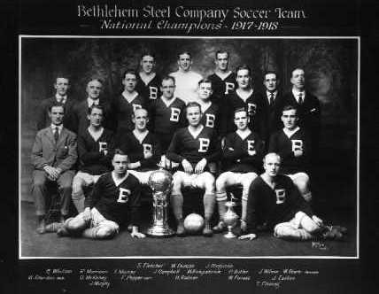
After winning the US Open Cup in 1915, Bethlehem Steel would win again 1916, in 1918 and 1919, and finally in 1926. A photo taken after their win in 1918 shows the team back in the navy blue jersey with white-trimmed V-neck (the photo is the featured image for this post). The logo is again a large serifed capital “B” in white located on the left breast.
In the summer of 1919, the club embarked on a tour of Scandinavia, leaving New York at the end of July. The bulk of the players returned to the United States in the first week of October although several players caused something of a stir by extending their stay in Europe to visit family in Scotland and England and did not return until the end of October.
 The photo to the left of the team training on board ship en route to Scandinavia shows a mixture of kits. Most of the players are wearing the current navy blue kit with white V-neck and large capital “B” logo. Several players are wearing what appears to be a lighter blue jersey that also has a white-trimmed V-neck and large capital “B” logo. One player is wearing the lighter colored kit from 1916 with the stylized “BSC” logo. This is the only photo I have seen in which the players do not appear to be wearing white shorts.
 As we can see in the photo to the right, upon arrival in Scandinavia, the Bethlehem team introduced a new jersey. The jersey again appears to be a lighter shade of blue, with a white-trimmed V-neck. The jersey also has white trim on the bottom.
Two new logos are on the jersey. On the right breast is a US stars and bars shield, possibly of the kind worn on the jerseys of the US team that toured Scandinavia in 1916 (which is pretty crazy when you consider World War One was going on at the time; the team included C.H. Spaulding of Philadelphia Disston as well as Thomas Murray and Neil Clarke of Bethlehem Steel). On the left breast is a differently stylized capital “B” logo, presumably in white.
 The photo to the left of the team in 1921 shows another mixture of jerseys. In addition to the generally standard white V-necked navy blue jersey with the capital “B” logo on the left breast, some of the players are wearing a similar jersey in which the difference is that the “B” logo is now located underneath the point of the V-neck.
1921 was the year that the club was moved to Philadelphia where it played in the inaugural season of the American Soccer League as the Philadelphia Field Club. The team featured many of the Bethlehem Steel players from the previous season and went on to win the league championship. But the team lacked fan support and was soon in financial trouble.  The owners then sold off many of the players and moved the team back to Bethlehem. It is not clear when in 1921 this photo was taken but when the team played as Philadelphia FC, they wore red jerseys with a “P” logo and possibly blue trim as shown in the photo to the right.
The photo of the team from the 1924-25 season to the left shows the team in the familiar white-trimmed V-neck jersey with the “B” logo on the left breast. The jersey again appears to be a lighter shade of blue when compared to the color of the players’ socks and the sweaters worn by the two players (who are almost certainly goalkeepers) in the middle of the back row.
 In the undated photo to the right of Bethlehem goalkeeper Dave Carson (he joined the team in 1923 and seems to have played with them through 1925) shows him in what appears to be some kind of lightweight training jersey in the summertime. The jersey appears to be white and the capital “B” logo on the left breast is slightly different from the standard serifed “B” on game jerseys in that it appears to be sans serif.
Finally, the undated photo below and to the left shows the team in action against the ASL powerhouse Fall River Marksmen. While I can’t say with total certainty, based on the Fall River uniform, I think the photo may be from around 1930, Bethlehem’s last season. The kit is quite similar to the one in the photo above from the 1924-25 season in that it appears to be of a lighter shade of blue but without a white trimmed V-neck. The familiar serifed “B” logo remains.
So there you have it, nine jerseys over nearly twenty years (plus one training shirt). While the various designs were important in marketing the team—or, in the words of team manager H.E. Lewis, creating the perception of the team as “the best uniformed and equipped soccer foot ball club” in the US—the designs almost certainly weren’t thought of as a source of revenue if only for the simple fact that it would be years before the replica jersey market would be developed. As we have seen, some of the new designs were related to specific events such as the Scandinavian tour in 1919. Given the fact that Bethlehem Steel were active in a variety of league and cup competitions in any given year, the need for different designs was real and the team was fortunate to have the resources to satisfy that need.
Did Bethlehem Steel FC use both navy blue and royal blue jerseys? While it is not possible to say so simply by looking at nearly one hundred-year-old black and white photos, there are enough clues to suggest it might be reasonable to conclude that they did. Anyone with color photographs of Bethlehem Steel jerseys, please get in touch.
What were the jersey’s made of?
Modern jerseys are wonders of chemistry, made from synthetic materials to be of light weight with good ventilation and the ability to efficiently wick sweat. What materials were Bethlehem Steel’s jerseys made from?
While I cannot say for certain, I can tell you what kinds of materials were used to make the jerseys on offer in the Spalding catalog. In the catalog for the 1915-16 season, four jersey materials were available. Model “No. V” ($1.50 each, $16.20 a dozen) was made from “good quality medium weight cotton.” Model “No. 602” was made from “good quality worsted” wool ($2.25 each, $24 a dozen) while model “No. 6FS” was made from “Sanitary cotton” (.75¢ each, $8.10 a dozen). Model “No. 4” was made from “good quality flannel” ($1.75 each, $18.90 a dozen). In 1915, one dollar had the buying power of about 22.50 2011 dollars so the Model No. 602 would cost the equivalent of about $50.
The “Spalding Flannel Knickebockers” were available in “fine quality” ($2.25 each) and “good quality” ($2 each) flannel, as was a model made of “Flannel, well made” ($1.50 each). A bargain priced version made of “silesia” was also available at .50¢. “Skull caps” were available for winter play in “Worsted, heavy weight” (.75¢) and “Worsted, light weight” (.50¢). “Spalding ‘Soccer’ Stockings” made of “Good quality worsted, with mercerized cotton feet, legs heavy ribbed” were available for $1.10 a pair, $12 a dozen.
By the time of the 1922-23 catalog, the No. V jersey would set you back $3 and the price of stockings had risen to $1.75. “Soccer Pants” were now available in “Heavy canvas” for $1.50 a pair while “Flannel pants, navy only” cost $3 a pair. “White jean pants” were also available for .90¢ each.
Editors note: A week after I wrote this article I came across this line in a report on the 1917 National Challenge Cup final on page 55 of the 1917-1918 Spalding Guide: “The old gold and blue of the Fall River Rovers, the pride of New England, flashed to a well-deserved victory over the far-famed light blue and white of the Bethlehem Steel Company eleven …” (emphasis added). So it seems that, at least for the 1916-1917 season, Bethlehem did wear something other than a navy blue jersey. Whether light blue equals royal blue, I still do not know.
 Photo credits: Featured image (National Champions 1917-1918), 1915 winter photo, 1919 Scandinavian tour photos, 1924-25 photo and photo of Dave Carson courtesy of Dan Morrison’s bethlehemsteelsoccer.org website. All other photos taken from Spalding’s Official Soccer Foot Ball Soccer Guide, 1914-15, 1916-17, 1917-18, 1922-23.

Stoked to see the history go back to my hometown of Bethlehem. I knew there was a deep soccer history, but never this much!
I have a photo of the 1921-22 team, when they were “Philadelphia FC.” They wore a “P” and, if memory serves, wore RED and white.
Dan Morrison used to have an outstanding Bethlehem Steel site. Did you find it?
I would love to see the photo! Thank you for the info about the color Bethlehem used as Philadelphia FC. The article will be corrected to reflect that info.
I have seen Dan Morrison’s wonderful site, bethlehemsteelsoccer.org (it is credited in the photo credits at the bottom of the article). Unfortunately, many of the photo links on the site are broken. The links to the local news articles from the day that he painstakingly transcribed are all active, though, and are a valuable resource. The same is true of the work you have done on your old Philadelphia Atoms website (What happened to that? It was essential for the research on Philadelphia Atoms-related articles that have been posted here.) as well as for the American Soccer History Archives and the Philadelphia Union website.
Cracking stuff, Ed.
Jesus, can you imagine running around for 90+ in worsted wool? Not to mention all these guys probably smoked like chimneys and oh yeah, worked in a steel mill. We’ve gone soft I tell you!
I hear you on the wool, but it might have been nice when playing in February. For the first ten minutes or so, anyway, before it became drenched with sweat and slush and mud and started to weigh 20 lbs!
They never wore anything that says BFC. It is quite clearly BSC as in Bethlehem Steel Company.
Regarding home and away kits, in 1916, the New Bedford Whalers had three full kits (according to Sporting Life’s January 1, 1916 article “New Bedford’s High Place in Soccer”). That might lead to the conclusion that Bethlehem Steel could also have had at least two complete kits, if not three.
Just come across this as I’m researching Bethlehem in order to colourise the picture v Brooklyn Celtic.
I don’t know if it helps but the colour plates and films used back then were very insensitive to all shades of blue, so blue tended to appear far paler than we would now expect if for example you turn down the colour on your TV. They also reacted strongly to red, so reds appear quite dark (which makes me think the 1921 “P” picture is in fact blue. Another quirk is that yellow can appear dark. It’s very confusing.
If anyone, by the way knows the colours of any other teams from the time get in touch with me at georgechilvers@tiscali.co.uk